Structuring Weekly & Monthly Time Overviews
Client
7pace | Appfire
Role
Lead Product Designer
Year
2024
Context
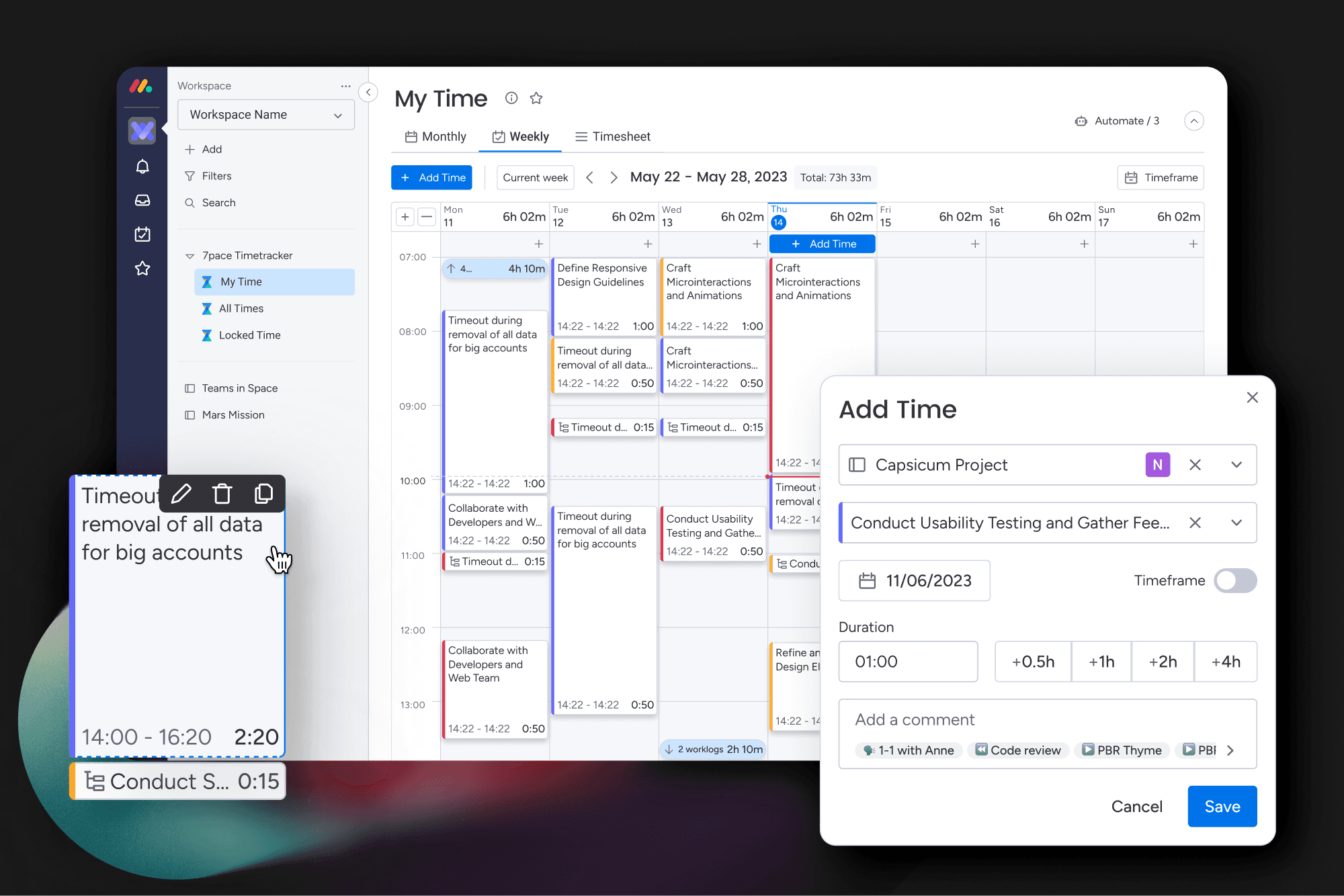
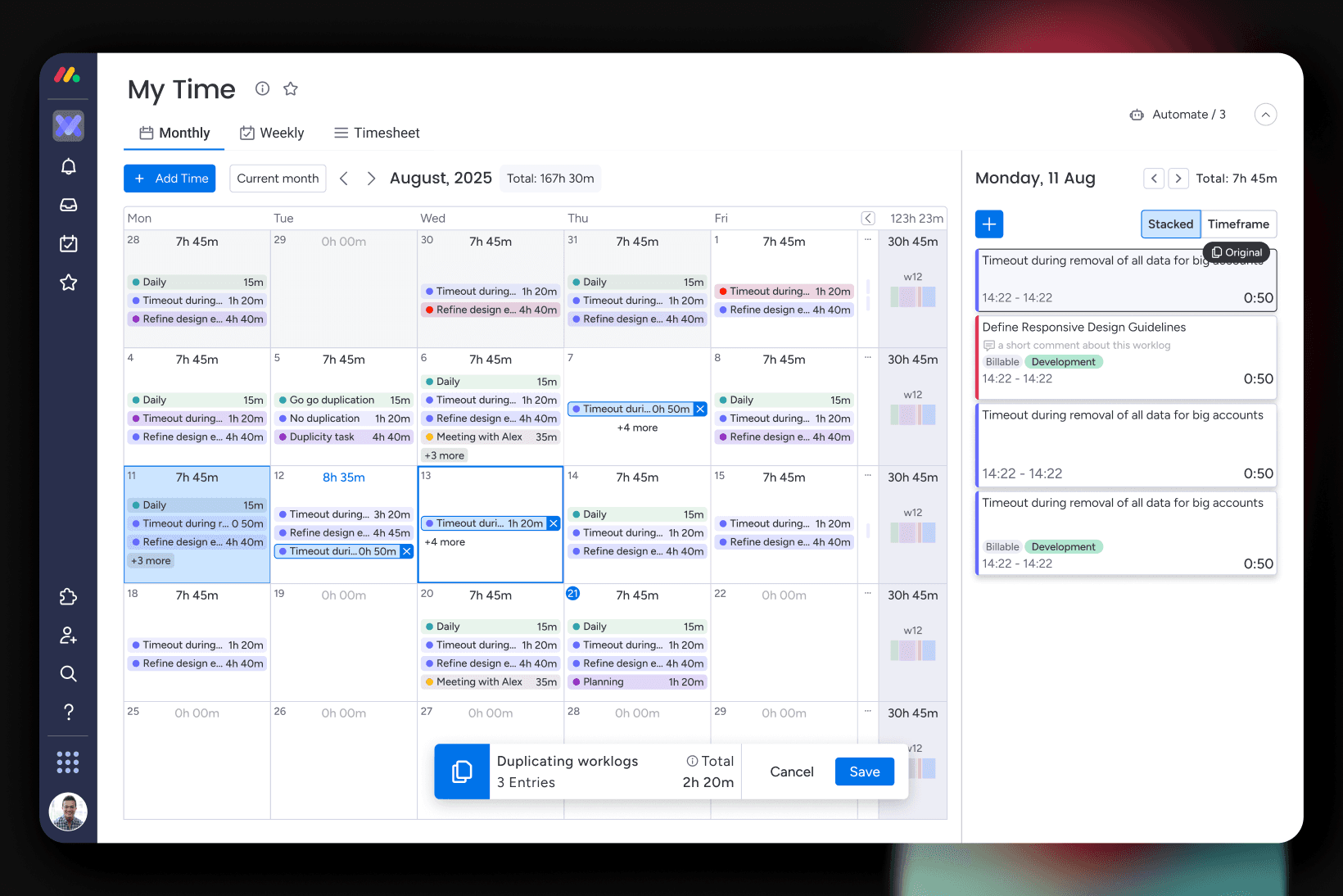
Daily time logging gives you data. It does not give you perspective. I designed the weekly and monthly overview features for 7pace to close that gap, giving individuals and teams a way to understand how their time actually distributed across longer periods, without leaving the product to pull a report.
Problem
Users could log every hour of every day and still have no clear picture of where their week went. Spotting patterns, identifying overload, or reviewing a month before a billing cycle required either manual calculation or exporting to a spreadsheet. The data existed. The visibility did not.
Concept
The design challenge was density without noise. Aggregated time data can easily become a wall of numbers that users scan past rather than actually read.
I focused on making patterns visible before the user reads anything. The weekly view surfaces distribution across days and categories at a glance. The monthly view gives the broader shape of the period without collapsing the detail users sometimes need to drill into. Both views use the same familiar time-based structures users already navigate in daily logging, so the learning curve is close to zero.
The balance between summary and detail was the main design decision throughout. Too much summary and the view is useless for anything beyond a quick check. Too much detail and it becomes another version of the log itself.


Outcome
Users could see how their time was actually distributed across a week or month without any manual effort. Patterns that previously required an export to spot became visible inside the normal workflow. For teams, it made period reviews faster and gave managers a shared reference point without needing a separate reporting tool.


