Designing a Visual Cloud Cost Experience
Client
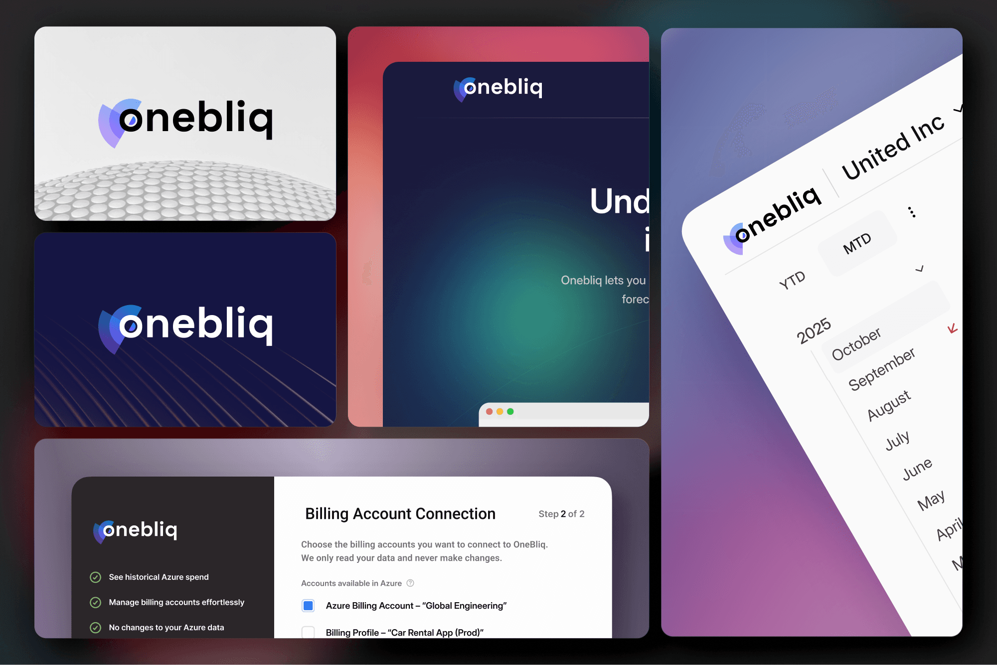
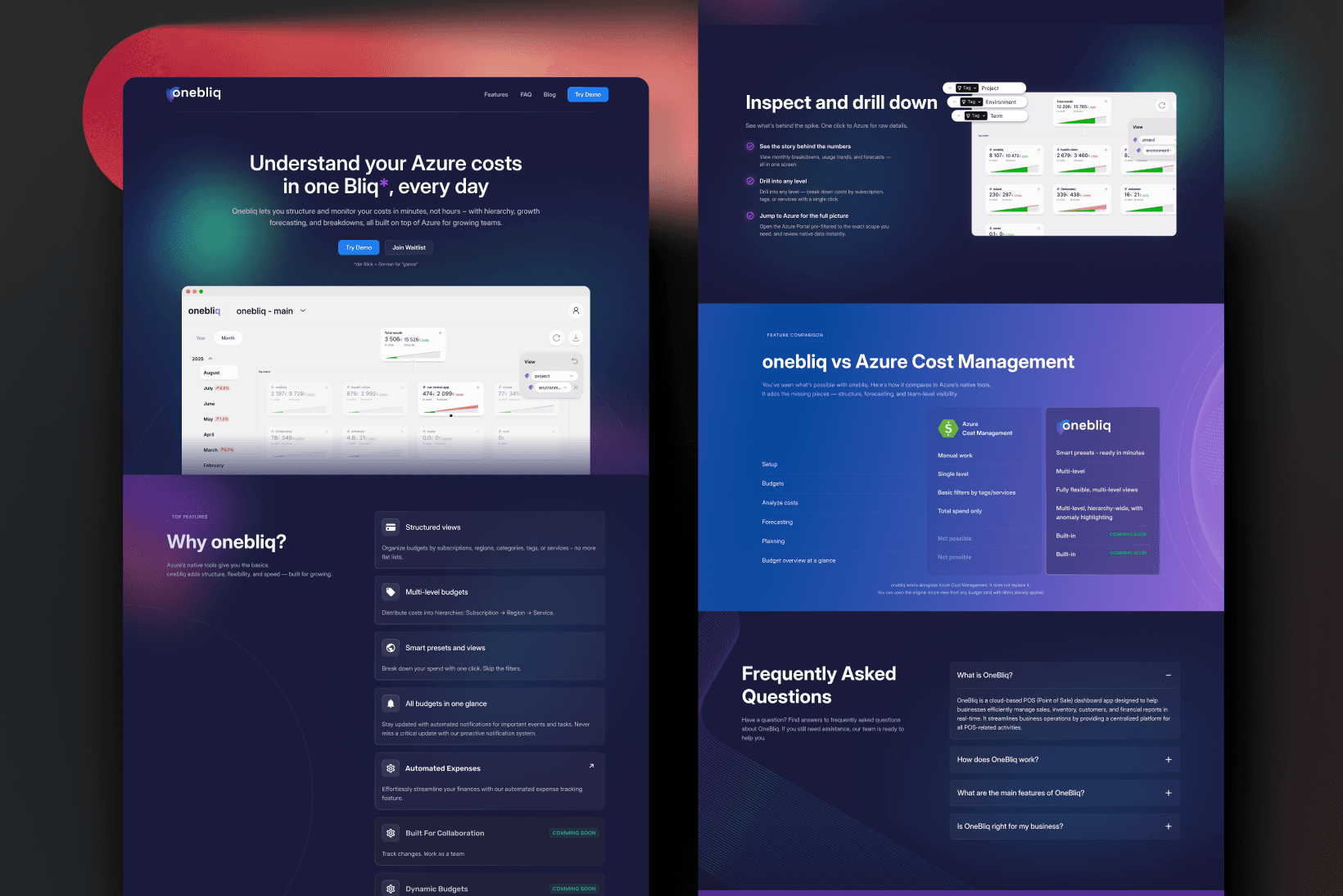
OneBliq
Role
Product Designer
Year
2025
Context
OneBliq is a lightweight Azure cost management product. I worked across branding, onboarding, and core product design, with a focus on making cloud cost data accessible to users who are not Azure experts.
Cloud cost tools are typically built for engineers. OneBliq's opportunity was to make the same information readable by finance, operations, and product leadership who need to understand what is happening, not just query it.
Problem
Existing cloud cost tools are table-heavy, filter-heavy, and technically structured. They mirror how Azure organizes data, not how humans understand spending patterns.
The result is high cognitive load, slow time-to-insight, and a user base effectively limited to those with technical Azure familiarity. Anyone else either does not use the tool or uses it wrong.
Concept
The core design shift was from querying data to navigating it.
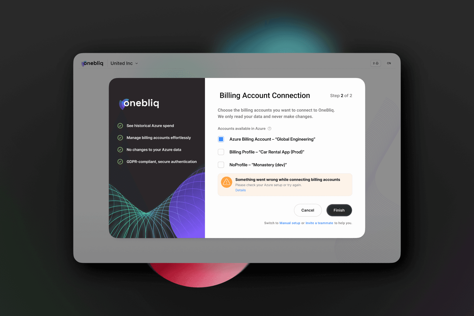
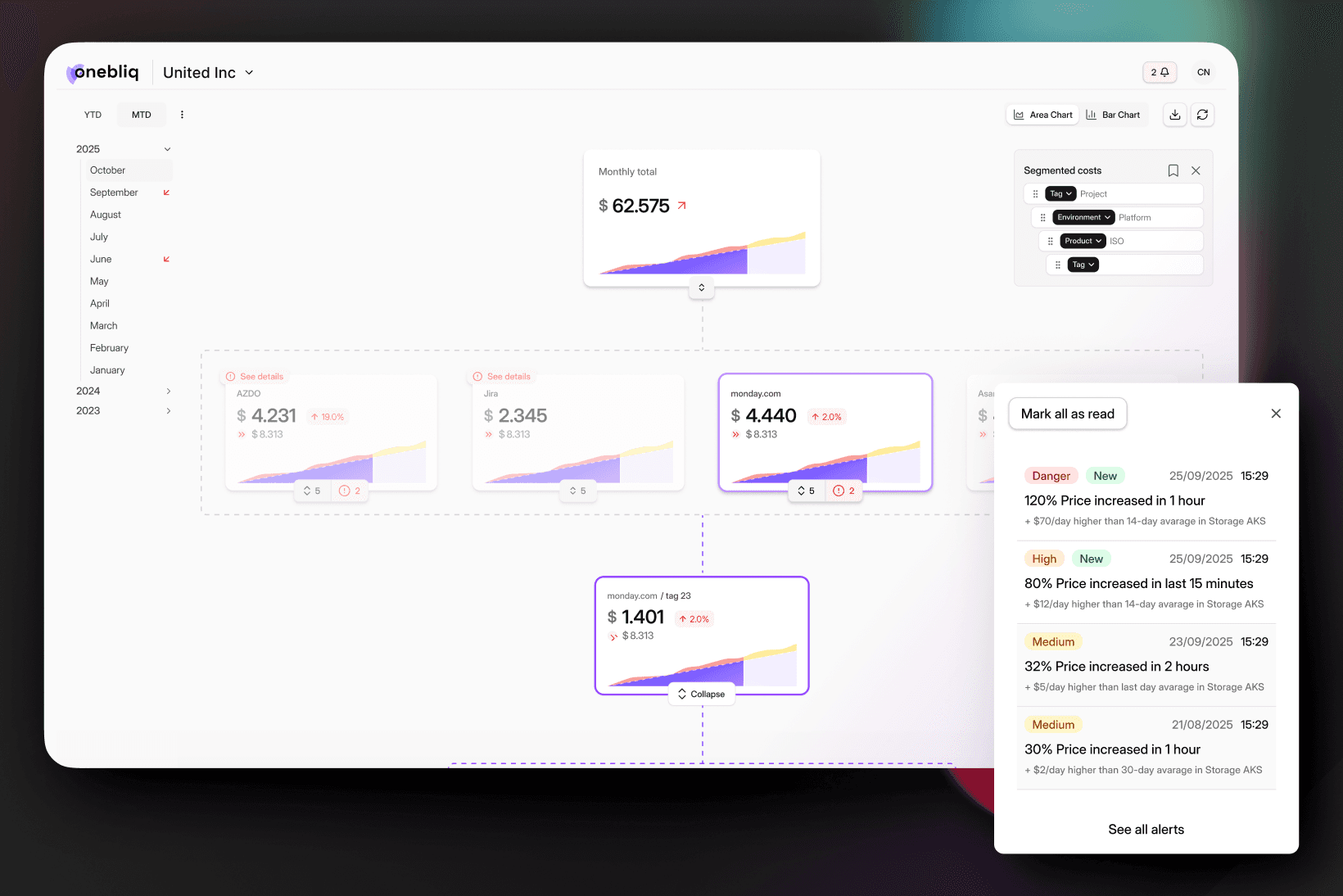
Instead of tables with filters, I designed a hierarchical, expandable interface that mirrors how Azure costs are structured but at a level of abstraction that non-technical users can follow. Progressive disclosure lets users move from high-level overview to granular detail without losing context or needing to start over.
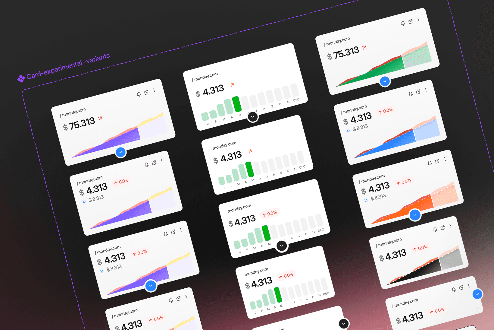
Visual encoding does the heavy lifting. Patterns, anomalies, and cost drivers become visible before the user reads a single number. The goal was to make the first five minutes in the product feel legible, not like a configuration task.
Outcome
A cost exploration experience that does not require a technical background to use. Faster time-to-insight, lower barrier to entry, and a visual language that scales as the product adds more data dimensions.
The foundation also supports future states: anomaly detection, automated cost summaries, and alert flows, all of which need a clear visual layer to land well.


